Gothic script (palaeography)
In-game article clicks load inline without leaving the challenge.
Gothic script is a name applied to the system of handwriting scripts that originally developed from Caroline minuscule and spread throughout Europe beginning in the late 11th century under the influence of the Normans and Angevins. The Gothic system gave rise to a complex hierarchy of book hands as well as cursive scripts used as court hands in medieval England and France. Gothic book hand, also known as blackletter, was used by early printers such as William Claxton as a typeface and during the 18th century late Gothic Secretary hand merged with Humanist hand to form Mixed or Round Hand, still used in Copperplate calligraphy today.
Etymology
The term Gothic was first used to describe blackletter in 15th-century Italy by Renaissance humanists who believed this style was barbaric, and Gothic was a synonym for barbaric. Flavio Biondo, in Italia Illustrata (1474), wrote that the Germanic Lombards invented this script after they invaded Italy in the 6th century.[citation needed]
History
After having been developed as a book script from Caroline minuscule and going through the transitionary phase of Protogothic; the Gothic system of scripts diverged into a complex hierarchy of book scripts and cursive court hands in 12th century England. By the 14th century, the French and English courts used separate cursive Gothic scripts which are called by palaeographers Cursiva Anglicana and Secretary Hand. Secretary hand became popular in England during the 16th century and supplemented Cursiva Anglicana as a departmental set hand. This combined with Humanistic hand in the 18th century to produced Mixed hand, eventually Round hand and Copperplate. Secretary hand adopted sloping Italic styles in the 17th century to form Engrossing hand used in many English wills, deeds and other legal documents throughout the 17th, 18th and 19th centuries.
Protogothic
The phase of script development denoted by the term Protogothic, which corresponds boradly to the art historical Romanesque period is considered a transitional form between Caroline minuscule and Gothic minuscule. It evolved in the areas which witnessed the rule of the Normans and Angevins and was used for both books and documents however in the case of the latter, with a slightly modified ductus, foreshadowing the rediscovery of cursive scripts, which had mostly been lost since antiquity. The rounded forms of Carolingian became angular flicks of the quill, and both letters and words became compressed.
Early Gothic is characterized by a number of factors. There are no capital letters for this script. Instead Roman Rustic, Roman Square or Uncial letters were used. Versals were most often Lombardic Capitals usually painted in bright colors. Other features are split ascenders, a storied 'a', both the standard 'r' and a half 'r' 〈ꝛ〉 used after letters with bowls. The long 's' 〈ſ〉 is used primarily, but there are examples of the short 's' in some manuscripts. Punctuation is limited, usually only full stops and commas, and they are usually rendered at the mid-line.
As the script continued to evolve and become ever more angular, vertical and compressed, it began its transition to the textura hands.
Textura

Gothic Textualis, Textura or Blackletter were a family of book hands originally developed from Protogothic from the end of the 12th century, characterised by lateral compression resulting in narrow, tall letter forms, square aspects and more elaborate treatment of minims. The scripts became known as Textura or Textualis because of their 'woven' look: the Latin verb texo means 'to weave' or 'plait', as in basket-work. It thus comes to mean 'fit together intricately in a regular pattern'. The treatment of minims is the determining feature in a descending hierarchy of four grades of textualis used to palaeographers and codicologists in diplomatics:
- Prescissa - meaning 'cut off', also known as Sine Pedibus, referring to the way in which the minims and some taller letters such as tall s and f lack 'feet': instead of ending with a serif, they are cut off in a neat horizontal at the base-line.
- quadrata - meaning 'square', also known as Fracta.
- Semi-Quadrata
- Rotunda - meaning 'round'.
According to Dutch scholar Gerard Lieftinck, the pinnacle of blackletter use was reached in the 14th and 15th centuries. For Lieftinck, the highest form of textualis was littera textualis formata, used for de luxe manuscripts. The usual form, simply littera textualis, was used for literary works and university texts. Lieftinck's third form, littera textualis currens, was the cursive form of blackletter, extremely difficult to read and used for textual glosses, and less important books.
Textualis was most widely used in France, the Low Countries, England, and Germany. Some characteristics of the script are:
- Tall, narrow letters, as compared to their Carolingian counterparts.
- Letters formed by sharp, straight, angular lines, unlike the typically round Carolingian; as a result, there is a high degree of "breaking", i.e. lines that do not necessarily connect with each other, especially in curved letters.
- Ascenders (in letters such as ⟨b⟩, ⟨d⟩, ⟨h⟩) are vertical and often end in sharp finials.
- When a letter with a bowl (in ⟨b⟩, ⟨d⟩, ⟨p⟩, ⟨q⟩) is followed by another letter with a bowl (such as ⟨be⟩ or ⟨po⟩), the bowls overlap and the letters are joined by a straight line (this is known as "biting").
- A related characteristic is the half r (also called r rotunda), the shape of ⟨r⟩ when attached to other letters with bowls; only the bowl and tail were written, connected to the bowl of the previous letter. In other scripts, this only occurred in a ligature with the letter ⟨o⟩.
- Similarly related is the form of the letter ⟨d⟩ when followed by a letter with a bowl; its ascender is then curved to the left, like the uncial ⟨d⟩. Otherwise the ascender is vertical.
- The letters ⟨g⟩, ⟨j⟩, ⟨p⟩, ⟨q⟩, ⟨y⟩, and the hook of ⟨h⟩ have descenders, but no other letters are written below the line.
- The letter ⟨a⟩ has a straight back stroke, and the top loop eventually became closed, somewhat resembling the number ⟨8⟩. The letter ⟨s⟩ often has a diagonal line connecting its two bowls, also somewhat resembling an ⟨8⟩, but the long s is frequently used in the middle of words.
- Minims, especially in the later period of the script, do not connect with each other. This makes it very difficult to distinguish between ⟨i⟩, ⟨u⟩, ⟨m⟩, and ⟨n⟩. A 14th-century example of the difficulty that minims produced is: mimi numinum niuium minimi munium nimium uini muniminum imminui uiui minimum uolunt ("the smallest mimes of the gods of snow do not wish at all in their life that the great duty of the defenses of wine be diminished"). In blackletter, this would look like a series of single strokes. As a result, dotted ⟨i⟩ and ⟨j⟩ (and briefly ⟨y⟩) were subsequently developed. Minims may also have finials of their own.
- The script has many more scribal abbreviations than Carolingian, adding to the speed in which it could be written.
a b c d e f g h i j k l m n o p q r s t u v w x y z {\displaystyle {\mathfrak {a}}{\mathfrak {b}}{\mathfrak {c}}{\mathfrak {d}}{\mathfrak {e}}{\mathfrak {f}}{\mathfrak {g}}{\mathfrak {h}}{\mathfrak {i}}{\mathfrak {j}}{\mathfrak {k}}{\mathfrak {l}}{\mathfrak {m}}{\mathfrak {n}}{\mathfrak {o}}{\mathfrak {p}}{\mathfrak {q}}{\mathfrak {r}}{\mathfrak {s}}{\mathfrak {t}}{\mathfrak {u}}{\mathfrak {v}}{\mathfrak {w}}{\mathfrak {x}}{\mathfrak {y}}{\mathfrak {z}}}
Cursiva

In contrast to the Textualis book hands, cursiva or cursive scripts developed as court hands to suit the requirements of record keeping. Protogothic semicursive developed in England at the end of the 12th century, probably in the royal chancery, into fully rediscovered Cursiva Anglicana, with the linking of letters and introduction of new features such as loops. Cursive developments also occurred on the continent and by the beginning of the 14th century the French chancery had perfected a distinctive 'prickly' cursive known as Secretary.

In cursiva, descenders are more frequent, especially in the letters ⟨f⟩ and ⟨s⟩, and ascenders are curved and looped rather than vertical (seen especially in the letter ⟨d⟩). The letters ⟨a⟩, ⟨g⟩ and ⟨s⟩ (at the end of a word) are very similar to their Carolingian forms. However, not all of these features are found in every example of cursiva, which makes it difficult to determine whether or not a script may be called cursiva at all.
Lieftinck also divided cursiva into three styles: littera cursiva formata was the most legible and calligraphic style. Littera cursiva textualis (or libraria) was the usual form, used for writing standard books, and it generally was written with a larger pen, leading to larger letters. Littera cursiva currens was used for textbooks and other unimportant books and it had very little standardization in forms.
Hybrida
Hybrida is also called Bastarda or Mongrel Hand is a hybrid form of the book and cursive scripts, with letter forms taken from both. It is a mixture of textualis and cursiva, developed in the early 15th century. From textualis, it borrowed vertical ascenders, while from cursiva, it borrowed long ⟨f⟩ and ⟨ſ⟩, single-looped ⟨a⟩, and ⟨g⟩ with an open descender (similar to Carolingian forms). Splayed hand developed as a form of Mongrel Hand with tunkated minims and wider aspect; hence resembling having been vertically squeezed and therefore splayed outwards. It was the precursor to later business or engrossing hands.
National forms
England
Textualis
English Textura developed from the form of Carolingian minuscule used there after the Norman Conquest, sometimes called "Romanesque minuscule". Textualis forms developed after 1190 and were used most often until approximately 1300, after which it became used mainly for de luxe manuscripts. English forms of Textualis have been studied extensively and may be divided into many categories.
The University of Oxford borrowed the littera parisiensis in the 13th century and early 14th century, and the littera oxoniensis form is almost indistinguishable from its Parisian counterpart; however, there are a few differences, such as the round final ⟨s⟩ forms, resembling the number ⟨8⟩, rather than the long ⟨s⟩ used in the final position in the Paris script.

Printers of the late 15th and early 16th centuries commonly used blackletter typefaces, but under the influence of Renaissance tastes, Roman typefaces grew in popularity, until by about 1590 most presses had converted to them. However, blackletter was considered to be more readily legible (especially by the less literate classes of society), and it therefore remained in use throughout the 17th century and into the 18th for documents intended for widespread dissemination, such as proclamations and Acts of Parliament, and for literature aimed at the common people, such as ballads, chivalric romances, and jokebooks.
Chaucer's works had been printed in blackletter in the late 15th century, but were subsequently more usually printed in Roman type. Horace Walpole wrote in 1781 that "I am too, though a Goth, so modern a Goth that I hate the black letter, and I love Chaucer better in Dryden and Baskerville than in his own language and dress."
Cursiva Anglicana

English cursiva (Cursiva Anglicana) began to be used in the 13th century, and soon replaced littera oxoniensis as the standard university script. The earliest cursive court hand of Gothic is Anglicana, a very round and looped script, which also had a squarer and angular counterpart, Anglicana formata. The formata form was used until the 15th century and also was used to write vernacular texts. An Anglicana bastarda form developed from a mixture of Anglicana and textualis, but by the 16th century, the principal cursive script used in England was the Secretary script, which came to England by way of France. Secretary script has a somewhat haphazard appearance and its forms of the letters ⟨a⟩, ⟨g⟩, ⟨r⟩, and ⟨s⟩ are unique, unlike any forms in any other English script. The legacy of these English cursive Gothic forms survived in common use as late as the 18th century in the court hand used for some legal records.
The term was coined by M B Parkes in the 1979. There were several varieties of the script peculiar to English manuscripts and documents in the fourteenth and fifteenth centuries, but they share recognisable characteristics such as the two-compartment ‘a’ and 8-shaped ‘g’. The documentary hands are often referred to as court hands, and were current at the same time as secretary, which eventually predominated; however, anglicana letter forms may be found mixed with secretary letter forms well into the sixteenth century.
From late in the thirteenth century scribes were trying to find a book hand that was not difficult to write on a small scale. At this time the tightly woven Gothic textualis was still the only alternative to a documentary hand, but English scribes seem to have happened upon a way of writing that soon became their ordinary book hand. Late in the twelfth century a semicursive Protogothic had been developing in England into a full-blown cursiva script, with its letters linked, loops, and other decorative embellishments, as a business hand (Gothic littera cursiva anglicana documentaria). From it emerges Anglicana, first in England, but later as a script local to Britain and extending also into northern France.
France
Textualis
French textualis was tall and narrow compared to other national forms, and was most fully developed in the late 13th century in Paris. In the 13th century there also was an extremely small version of textualis used to write miniature Bibles, known as "pearl script". Another form of French textualis in this century was the script developed at the University of Paris, littera parisiensis, which also is small in size and designed to be written quickly, not calligraphically.
Cursiva
French cursiva was used from the 13th to the 16th century, when it became highly looped, messy, and slanted. Bastarda, the "hybrid" mixture of cursiva and textualis, developed in the 15th century and was used for vernacular texts as well as Latin. A more angular form of bastarda was used in Burgundy, the lettre de forme or lettre bourgouignonne, for books of hours such as the Très Riches Heures of John, Duke of Berry.
Germany
Despite the frequent association of Gothic or Blackletter with German, the script was actually very slow to develop in German-speaking areas. It developed first in those areas closest to France and then spread to the east and south in the 13th century. The German-speaking areas are, however, where blackletter remained in use the longest.
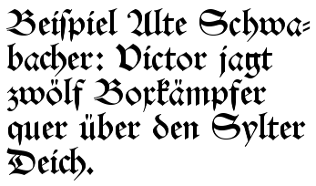
Schwabacher typefaces dominated in Germany from about 1480 to 1530, and the style continued in use occasionally until the 20th century. Most importantly, all of the works of Martin Luther, leading to the Protestant Reformation, as well as the Apocalypse of Albrecht Dürer (1498), used this typeface. Johann Bämler, a printer from Augsburg, probably first used it as early as 1472. The origins of the name remain unclear; some assume that a typeface-carver from the village of Schwabach—one who worked externally and who thus became known as the Schwabacher—designed the typeface.
Textualis
German-made Textualis type is usually very heavy and angular, and there are few characteristic features that are common to all occurrences of the script. One common feature is the use of the letter ⟨w⟩ for Latin ⟨vu⟩ or ⟨uu⟩. Textualis was first used in the 13th and 14th centuries and subsequently became more elaborate and decorated, and it was generally reserved for liturgical works.
Johann Gutenberg used a textualis typeface for his famous Gutenberg Bible in 1455. Schwabacher, a blackletter with more rounded letters, soon became the usual printed typeface, but it was replaced by Fraktur in the early 17th century.
Italy
Rotunda
Italian blackletter also is known as rotunda, as it was less angular than those produced by northern printing centers. The most common form of Italian rotunda was littera bononiensis, used at the University of Bologna in the 13th century. Biting is a common feature in rotunda, but breaking is not.
Italian Rotunda also is characterized by unique abbreviations, such as ⟨q⟩ with a line beneath the bow signifying qui, and unusual spellings, such as ⟨x⟩ for ⟨s⟩ (milex rather than miles).
Cursiva
Italian cursive developed in the 13th century from scripts used by notaries. The more calligraphic form is known as minuscola cancelleresca italiana (or simply cancelleresca, chancery hand), which developed into a book hand, a script used for writing books rather than charters, in the 14th century. Cancelleresca influenced the development of bastarda in France and secretary hand in England.
The Netherlands
Textualis
A textualis form, commonly known as Gotisch or "Gothic script", was used for general publications from the fifteenth century on, but became restricted to official documents and religious publications during the seventeenth century. Its use persisted into the nineteenth century for editions of the State Translation of the Bible, but otherwise became obsolete.