Map
In-game article clicks load inline without leaving the challenge.
In cartography, a map is a two-dimensional representation of the Earth's surface depicting the spatial layout of geographical features. Depending on its purpose, it may also display information such as climatic, demographic, or socio-economic data. The term "map" is also used for depictions of celestial bodies, or in a figurative sense to designate a condensed representation of information or relationships.
One of the earliest preserved maps is inscribed on a clay tablet, dated to 2300 BCE, and found in Nuzi within the Akkadian Empire (in modern Iraq). Around 490 BCE, Greek geographer Hecataeus created a map of his known world, encompassing the Mediterranean Sea and most of Europe, North Africa, and the Middle East. Maps played a major role in the Age of Discovery: on his first voyage in 1492, Christopher Columbus carried a world map created by Paolo dal Pozzo Toscanelli. The applications of cartography expanded in the late 17th century with the invention of thematic maps which portrayed a specific kind of data–such as rainfall or population density–in contrast to simply portraying major geographic features such as rivers, mountains, and cities. The rapid expansion of road networks and mass transit systems in the 20th century created a market for mass-produced maps aimed at the traveling public. Geographic Information Systems (GIS) allowed vast amounts of geographic data to be dynamically displayed on computer screens, so users could interactively zoom, pan, and choose which data to view.
Maps support a large variety of purposes. A common application of maps is route planning to find restaurants, parks, and other points of interest. Commercial and recreational traffic in the air and water use maps (called "charts" in this context): airplane traffic relies on aeronautical charts and water traffic uses nautical charts. Government-related applications include census, elections, administration, and property taxation. Emergency, fire, and police services use maps for evacuation planning, dispatching fire or police responders, and coordinating disaster relief. Governments can also use maps to inform policy decisions about voting district boundaries, emergency planning, labor force analysis, utility service planning, planning social and education services, poverty analysis, marketing analysis, flood risk, and agriculture. Military and security forces use maps for mission planning, surveillance, border management, and intelligence analysis. Scientists from many disciplines use maps to manage spatial data when studying a variety of subjects such as geology, weather, earthquakes, and population distribution.
Map design is the process of selecting and arranging imagery and graphic symbols to effectively communicate geographic information. A cartographer must make many choices when designing a map, such as which data to include (or omit), coverage area, legend, orientation (which direction is north), scale, projection, coordinate system, symbols, shapes, colors, labels, and typography. The choices depend on the purpose of the map and its intended audience. Maps can be classified in a variety of ways, including by application, such as geological maps, road maps, or cadastral maps. Classifications based on design attributes such as south-up maps, 1:10,000 scale maps, or Mercator projection maps. Other kinds of maps are thematic maps, topographic maps, digital maps, and topological maps. To create a new map, a cartographer must obtain geographic data and assemble it. Geographic data used for mapmaking may include imagery, scanned paper maps, surveying data, geographical features, and terrain (elevation) data.
Definition and etymology
The word "map" first appeared in English around 1120 CE. It originated either from the Late Latin word mappa ('napkin, cloth') originating in Classical Latin, or from French mappemonde or Latin mappa mundi (both 'map of the world').
The meaning of the word "map" depends on the context. Within the realm of cartography, early definitions focused on representations of the Earth printed on paper, as in the 1938 definition by Erwin Raisz (in the first major book on cartography in the English language) "a conventionalized picture of the Earth's pattern as seen from above, to which lettering is added for identification".
In the late 20th century–following the advent of computers and interplanetary exploration–the cartographic community adopted broader definitions which included media other than paper, and depicting things other than the Earth, as in the brief 1976 definition by Arthur H. Robinson "a graphic representation of the milieu". A definition used within the discipline of cartography–created in 1987 by John Brian Harley and David Woodward– is "graphic representations that facilitate a spatial understanding of things, concepts, conditions, processes, or events in the human world".
Outside of cartography, "map" is used as an analogy or metaphor in a broad range of contexts. In the nineteenth century, the New English Dictionary (predecessor to the Oxford English Dictionary) included the definition "circumstantial account of a state of things." The Oxford English Dictionary, as of 2026, includes the primary definition (a representation of the Earth's surface) and also includes "a diagram or collection of data showing the spatial distribution of something or the relative positions of its components" and the figurative meaning "a conceptualization or mental representation of the structure, extent, or layout of an area of experience, field of study, or ideology".
History
Antiquity to 15th century

No one knows when or where humans created the first maps, but the desire to preserve and share geographic data is so fundamental to human nature, it is likely that maps were produced very early in human history. One of the earliest preserved maps is inscribed on a clay tablet, dated to 2300 BCE, and found in Nuzi within the Akkadian Empire (in modern Iraq). Egyptian maps on papyrus from 1300 BCE show the location of gold mines. A document from China dated 1020 BCE describes maps used for town planning purposes. An early Chinese map that is still preserved from about the 4th century BCE, which shows more sophistication than contemporary maps originating in Europe.
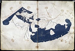
Around 490 BCE, Greek geographer Hecataeus created a map of his known world, encompassing the Mediterranean Sea and most of Europe, North Africa, and the Middle East. One of the most influential early maps was a map of the world prepared around 150 CE by the Greco-Roman geographer and scientist Ptolemy. Maps created by the Romans–in contrast to the Greek emphasis on science–were for political and administrative purposes: in 44 BCE Julius Caesar commissioned a map of the known world, which was prepared by Agrippa. The Romans also produced the Tabula Peutingeriana which diagrams most major roads of their empire. Like many modern transit maps, it is schematic in nature and is not drawn to scale.
A notable set of maps from the Islamic world was the Nuzhat al-Mushtaq ('The Book of Pleasant Journeys into Faraway Lands')–an atlas created by Arab geographer Muhammad al-Idrisi in 1154, at the request of Norman King Roger II. Within Medieval Europe, a large number of mappa mundi ('maps of the world') were created, and–as Christianity dominated much of medieval society–many of them incorporated religious themes. Scholars refer to some of these maps as T-O maps because the map depicted the Earth as a circular "O" shape, containing three continents (Europe, Asia, and Africa) separated by waters in a "T" shape.
Maps played a major role in the Age of Discovery. On his first voyage in 1492, Christopher Columbus carried a world map created by Paolo dal Pozzo Toscanelli. The map did not include the Americas, and it greatly underestimated the size of the Earth. That year, Martin Behaim created the Erdapfel ('Earth apple')–one of the first globes.
16th century to present

In the 16th century, the accuracy of maps improved with the development of triangulation (initially described by Gemma Frisius in 1533) which improved older surveying techniques by using devices such as plane tables and theodolites to precisely measure angles between landmarks. During this era, cartographers advanced the study of map projections, notably Gerardus Mercator who created the Mercator projection in 1569 which proved valuable to navigators. Humanity's impulse to create maps was illustrated when Europeans encountered indigenous peoples in Central and South America and in Oceania: there they found maps already in use for navigation, administration, and commerce.
The applications of cartography expanded in the late 17th century with the invention of thematic maps which portrayed a specific kind of data–such as rainfall or population density–in contrast to simply portraying major geographic features such as rivers, mountains, and cities. In the late 18th century, the accuracy of maps increased dramatically with the perfection of clocks that could keep accurate time for extended periods while withstanding the violent motions of a ship and the temperature changes of different climates. These chronometers enabled longitude to be computed accurately at any point on Earth.

Military applications led to innovations in cartography. In the late 18th century, Napoleon created a corps of geographic engineers[fr] to produce topographic maps for military use. The rise of nationalism in the 19th century was reinforced by maps, as noted by the French historian Christian Jacob[fr] who wrote that maps focused on individual nations were "the visual glue of a sense of national identity". During WWI, cameras were mounted in airplanes which flew over battlefields and took photographs that were later analyzed for reconnaissance purposes. Some photos were used to update trench maps, at scales up to 1:10,000. In the early 20th century, maps were widely used for propaganda purposes–both to promote territorial claims and to exaggerate threats from perceived enemies.
The rapid expansion of road networks and mass transit systems in the 20th century created a market for mass-produced maps aimed at the traveling public. Road maps and transit maps became commonplace, including the 1933 London Underground map which used an innovative schematic design that was more useful than a geographically accurate layout. After WWI, civilian cartographers used aerial photography in conjunction with the new science of photogrammetry to generate maps more rapidly than was possible with ground-based surveying. In the mid-20th century, the study of cartography shifted to a more rigorous and quantitative foundation, emphasizing the fundamentally mathematical nature of the discipline. Cartography was revolutionized in the latter half of the 20th century, as computers and satellites enabled the new fields of computer cartography and remote sensing. Geographic Information Systems (GIS) allowed vast amounts of geographic data to be dynamically displayed on computer screens, so users could interactively zoom, pan, and choose which data to view.
Applications

Maps support a large variety of purposes and functions. Perhaps the most common applications of maps in everyday life relate to navigation and route planning. Maps are useful for finding nearby restaurants, hospitals, gas stations, hotels, parks, and other points of interest. People planning vacations or outings often rely on maps to identify destinations, using road maps and tourism-related maps. Commercial and recreational traffic in the air and water use maps (called "charts" in this context): airplane traffic relies on aeronautical charts and water traffic uses nautical charts.
Government-related applications include census, elections, administration, and property taxation. Local or regional governments use maps for urban planning purposes such as designing roads, public transportation, housing developments, and green spaces. Public and private utilities use maps for maintaining distribution systems for water, electricity, gas, telecommunications, and sewer. Emergency, fire, and police services use maps for evacuation planning, dispatching fire or police responders, and coordinating disaster relief. Cadastral maps are an essential tool for managing real property boundaries, which are required for monitoring construction progress, evaluating neighborhood needs and property values, and zoning regulations.
Governments can also use maps to inform policy decisions about voting district boundaries, emergency planning, labor force analysis, utility service planning, planning social and education services, poverty analysis, marketing analysis, flood risk, and agriculture. Environmental protection and management is an area where maps are useful, including monitoring forests and wildlife habitats; monitoring climate change, floods, wildfires, and pollution. Foresters, ranchers and farmers can use maps to manage land, resources and forests.

Military and security forces use maps for mission planning, surveillance, border management, and intelligence analysis. Politicians use maps to promote political agendas or propaganda: both within a nation or related to international disputes. In the commercial realm, maps are used for advertising or other persuasive purposes.
Scientists from many disciplines use maps to manage spatial data when studying a variety of subjects such as geology, weather, earthquakes, and population distribution. Maps help public health authorities track disease outbreaks, and scientists map genetic patterns in populations. Educators often use maps as tools when teaching geography, history, environmental science, and spatial thinking.
Journalists frequently use maps as part of their reporting to help audiences understand the geographic context of stories and events. Maps are sometimes considered to be things of beauty and displayed as artwork or home decorations, or incorporated as an element of a larger work of art.
Design
Map design is the process of selecting and arranging imagery and graphic symbols to effectively communicate geographic information. A cartographer must make many choices when designing a map, such as which data to include (or omit), coverage area, legend, orientation (which direction is north), scale, projection, coordinate system, symbols, shapes, colors, labels, and typography. The choices depend on the purpose of the map and its intended audience.
Layout and hierarchy
An important aspect of map design is the layout, which involves arranging the geographic data and the auxiliary elements (such as the title, legend, map scale, and insets). Cartographer Arthur H. Robinson defines layout as "the process of arriving at proper balance. In a well-balanced design, nothing is too light or too dark, too long or too short, or too small or too large, in the wrong place, or too close to the edge."
A map's design should visually distinguish key elements in the map from less important elements–a consideration called visual hierarchy. The elements with the highest priority in the visual hierarchy are the map title and the key features related to the map's purpose. Middle-priority elements are the background geography. The lowest priority elements are notes and supporting information, often found in the margins. Visually, key elements should appear to be in the foreground, while less important elements are in the background–a figure-ground relationship.
The background graphics of a map are called the basemap, and its purpose is to provide context for higher priority elements. The basemap may include landforms, topography, transportation networks, or imagery.
Coverage area
Maps can be created in a variety of shapes. A common shape is rectangular, but some polar maps are circular in shape. The edge of the map's geographical content is delimited by a neatline; the region outside the neatline is the margin.
Some maps cover a quadrangle, which is a region of the Earth's surface bounded by two parallels (circles of constant latitude) and two meridians (lines of constant longitude). The neatline (extent) of a map may not use the same coordinate system as the map's data; for example, USGS topographic maps use a latitude/longitude quadrangle for the extent, but UTM for the map's projection and geographic coordinates. In some maps, the neatline may not be a perfect rectangle or may not have 90 degree corners.
- Maps with non-rectangular extent
- An equidistant projection centered on Khartoum
- A land hemisphere map with extensions
- A 1657 south-up map of the South Atlantic
Scale

The scale of a map is a numerical value that indicates how measurements in the map relate to the reality they depict. Map scales are typically stated as a ratio, such as 1:12,000, which means that every centimeter (cm) on the map represents 12,000 cm (or 120 m) on the ground. Scales can be useful in many contexts, for example, a navigator can measure the distance between two points on a map, and divide by the scale to obtain an approximate value of the distance between the two points in the world.
Maps can be classified as "small scale" (lower resolution, covering large areas) or "large scale" (higher resolution, covering small areas). There is no official dividing line between large and small scales, although 1:500,000 or 1:1,000,000 are sometimes used as partitions. In some contexts, a third term–"medium scale"–may be used for maps with scales ranging from about 1:250,000 to 1:1,000,000.
Because map projections introduce some distortion when the earth's surface is flattened onto paper, the scale of a map always varies through the map. For large scale maps that cover a small region, the variations of the scale are generally small, and the scale can often be treated as constant across the map. But for small scale maps that cover large areas like continents or the whole earth, the variations in scale can be large, and the scale should be treated as merely a nominal value.
The notion of scale is closely related to the concept of resolution, which is the granularity or precision with which XY locations are measured. For example, assuming one can resolve locations within half a millimeter on a paper map, that determines the map's resolution. Thus, a 1:10,000 scale map has a resolution of 5 m; and a 1:1,000,000 scale map has a resolution of 500 m. Conversely, a raster image of the earth with each pixel representing 2 km corresponds to a map scale of 1:4,000,000.
Map scales were originally used in the context of paper maps, where the ratio of map-to-reality has an unambiguous definition. But scales can also be applied to digital map databases. Since a database does not have a definitive paper representation, the scale is instead based on the resolution of the database's XY location values. The resolution of a database's XY locations reflects the amount of generalization or decluttering that has been applied to the objects in the database. For example, a database that contains features stored with a 5 m resolution could be considered to have a scale of 1:10,000. Although the data in a cartographic database may be visualized at any magnification, it is best displayed at scales ranging from 0.5 to 2.0 times the scale suggested by the data's resolution.
Generalization

Generalization is the process of reducing the information content in a map so the map more effectively performs its intended purpose. The process for generalizing a particular map depends on the type of map, its scale, and its audience. Procedures performed during generalization include selection, simplification, exaggeration, aggregation, smoothing, elimination, and symbolization.
The process of generalization is functionally the same for both manually designed maps and interactive digital maps. However, generalization of interactive maps is partially automated by software applications.
The first step in generalization is typically selection, which is simply choosing which types of features to include in the map. Depending on the purpose of the map, the mapmaker may omit, for example, roads, buildings, bodies of water, or towns with a population under 100,000.
Simplification is the process of simplifying a particular feature (such as a river, grove of trees, group of buildings, etc.) by eliminating detail. For example, a grove of eight distinct trees may be replaced by one tree; or a fence defined by 20 straight segments may be reduced to five segments. The degree of simplification depends on how many features should appear on the final map, and how densely they should be placed.
The process of exaggeration involves enlarging some aspect of an object to better convey the object's real-world essence. Aggregation is grouping several distinct objects together into one. Examples are grouping multiple point objects into one; or multiple point objects into an areal object; or multiple areal objects into one. Smoothing a line or perimeter involves replacing the line with a smoother version that captures the essence of the line while eliminating jagged, fine-scale features. Symbolization is the process of choosing a graphical depiction to represent each real-world object. Selecting the graphical attributes of the depictions–including shape, color, size, and pattern–is an important part of the symbolization process.
Symbolization
Symbolization is the process of selecting graphical markings to represent real-world geographic features or data. The markings may include a wide variety of shapes, dots, icons, symbols, and other visual indicators. The symbolization may indicate magnitude or kind by varying attributes of the graphics, such as color, shape, size, and pattern. The meaning of the graphics are often explained in a map legend in the map, or on a separately published document.
An important application of symbolization is representing the kind or magnitude of a specific datum across a map, as is commonly required for thematic maps. Symbolization techniques suitable for that purpose include:

- Proportional symbols–A map with multiple symbols (such as circles) depicting the datum being represented, and the area of each symbol is proportional to the data's value.
- Lines of constant value (isopleth map)–Lines (usually closed loops) that follow constant values of the datum being represented. Also called "isarithmic map". Elevation contour lines are an example of isopleths.
- Dots (dot distribution map)–The datum is represented as dots (usually all the same size), where each dot represents a fixed quantity of the data.
- Colored areas (choropleth map)–A thematic map of an area composed of multiple regions (for example, administrative boundaries), each region colored with a single color, and the color variation (hue or lightness) indicates the value of the datum being represented.
- Colored areas (dasymetric map)–A thematic map of an area which is subdivided into regions based on the datum being represented, each region colored with a single color, and the color variation (hue or lightness) indicates the value of the datum. A dasymetric map is similar to a choropleth map because both vary colors to represent data in areal regions. A dasymetric map has more flexibility than a choropleth map, because the borders of the colored regions in a dasymetric map are determined by the cartographer (based on the nature of the data) in a way that best communicates to the user; whereas a choropleth map typically uses borders that rigidly correspond to artificial political or administrative boundaries.
Projection

A projection is an algorithm that transforms all or part of the Earth's surface into a 2-dimensional representation. There are dozens of projections that mapmakers may choose from when creating a map. All projections introduce some distortions into the representation because it is impossible to force a spheroidal surface into a flat shape without tearing or stretching it.
Some projections preserve important characteristics of the spheroidal surface. Equal-area projections preserve the areas of countries or regions. Conformal projections preserve the angles between intersecting lines, and give the impression that shapes are approximately preserved. Equidistant projections preserve distances between one or two specific points to all other points. Some projections–called compromise projections–try to balance multiple goals, without perfectly achieving any one of them; a notable example is the Robinson projection.
Projections commonly used for maps of the whole earth include Goode homolosine projection, Mercator, and Robinson. For maps that cover large parts of the globe (but not the full globe) common projections include Lambert azimuthal and Miller cylindrical.
- Some projections of the Earth
- Interrupted Goode homolosine
- Miller cylindrical
- Robinson
- Van der Grinten
A controversial projection is Web Mercator–a variant of the standard Mercator projection–which was adopted by Google around 2005 for use in their online zoomable global map. The projection has been criticized for its large distortions in the higher latitudes, as well as for inaccuracies in coordinates when zoomed-in.
Coordinate system


When a map displays coordinates of places and objects, the mapmaker must select a coordinate system, which is specified as a geodetic datum. A geodetic datum consists of two independent parts: a vertical datum for elevation (height) coordinates, and a horizontal datum for XY position coordinates.
Vertical datums are imaginary surfaces used to measure an object's Z location (height). Vertical datums are categorized as ellipsoids or geoids. An ellipsoid, such as WGS84, is an imaginary, smooth spheroid that roughly approximates mean sea level. Geoids approximate sea level more precisely: they are the shape the surface of the world's oceans would take under the influence of Earth's gravity and rotation alone, without winds or tides. Geoids are not a smooth spheroid, but have undulations due to the way earth's varying density influences gravity.
Horizontal datums define a coordinate system for horizontal locations and ignore elevation (height). Horizontal datums are categorized as ellipsoidal or projected. For example, the location of the Augusta Raurica archaeological site in Switzerland may be described as 47.533860°, 7.721402° (latitude, longitude) in an ellipsoidal datum (WGS84) or–alternatively–as 403767 m, 5265285 m (XY) in a projected system (UTM zone 32 North).
Maps covering the entire earth often use an ellipsoidal horizontal datum which measures the location, in degrees, as latitude and longitude. There are several ellipsoidal horizontal datums available, including World Geodetic System 84, European Datum 1950, and North American Datum 83.
Another type of horizontal datum is a projected coordinate system, which uses XY Cartesian values. These datums specify XY locations in meters or feet (rather than degrees), and are thus sometimes more convenient to use than ellipsoidal datums. A notable projected coordinate system is Universal Transverse Mercator (UTM) which is commonly used for military applications because it is a global system in which angles are accurately represented and XY locations are measured in meters, which may be more convenient than degrees.
Many nations define horizontal datums tailored to the country or its provinces. These are called local datums, and are typically projected coordinate systems. For example, Britain uses a transverse Mercator projection for their Ordnance Survey National Grid. A nation may have many such coordinate systems, each tailored for a specific province, state, or region. For example, the US uses 125 coordinate systems that cover the country.
Colors and patterns

Colors can play an important role in map design. A map produced with a single color can confuse readers since every line and object is the same color; even a small amount of color can significantly improve the readability of map. Any color may be characterized by a particular combination of three independent attributes: hue, lightness, and saturation. Of those attributes, hue is generally used to indicate important distinctions within a map. Some maps use hue conventions such as: blue for water; green for vegetation; yellow or tan for arid regions; and brown for topographic contour lines. Lightness or tint can also be used to distinguish features in a map, particularly for progressively coloring regions in a quantitative map.
In maps, patterns are repeating design motifs that fill areas and convey information to the user. The patterns may consist of lines, dots, pictographs, or hatching. For example, patterns may be used to distinguish biomes such as swamp, desert, or forest. The International Geographical Union published a set of patterns to be utilized to designate soil types, including patterns for mud, clay, sandstone, and gravel. Colors and patterns may be used in combination within a single area.
Typography and labels

Many maps include textual labels that identify features. The design and layout of the text has a major influence on the overall graphical quality of the map. Maps often use multiple fonts and typefaces on a map in order to convey information to the user. For example, a map may use italic, boldface, or various sizes of lettering to indicate water features vs land features, or to designate the size of city or town. Positioning textual labels in a manner that is helpful and attractive is a difficult, but important process. Positioning can be performed manually by a cartographer, or automatically by software algorithms. Positioning guidelines that are sometimes used include:
- Text should be aligned horizontally, although in large maps covering the whole earth or large regions (called "small scale" maps), the text may instead be aligned along lines of latitude is acceptable
- Text should generally be in a straight line, not curved. Exception: when aligning text along lines of latitude on a small-scale map
- Spacing between letters should generally be tight
- When text and graphical objects (such as lines) interfere, the text has priority and the graphic should be interrupted
- A name should be entirely on land or on water, but not straddle both
- Labels of point features should be offset in a consistent manner, for example, above and slightly to the side of the feature
Orientation

The orientation of a map is the geographical direction toward the top of the map. Modern maps generally orient maps north up. If a map has a non-north orientation (such as magnetic north up) the map will usually include a graphical indicator pointing to true north.
An early map with a known orientation is an Akkadian Empire clay tablet with an east up map, circa 2300 BCE. The orientation of ancient Egyptian maps is uncertain, but some may have been oriented south up.
In ancient and Middle Ages Europe, orientation varied, and many maps did not contain an explicit indication of their orientation. The archetypes of the Tabula Peutingeriana and Ptolemy's map probably were north up. Mappa mundi were oriented in all four cardinal directions. Many T and O maps were drawn with east at the top but some displayed west or south up.
Although most modern government-produced maps are north up, some maps intended for recreational or tourism use may employ an unusual orientation if the region being depicted is an unusual shape. An example is this map of the Blue Ridge Parkway, which is a 755km (469mi) long road that runs diagonally from southwest to northeast. The map's top is to the northeast.
Auxiliary elements


Maps often contain a variety of elements or marginalia that supplement the primary geographical imagery. A map scale is often indicated on a map, either textually or as a graphical scale bar. Many maps, particularly if their orientation is not north up, include an orientation indicator which points north. Titles are displayed in many maps, although some maps do not need a title and omit it.
Legends are a critical component of many maps, because they provide the user with essential keys to understanding the map. Legends define graphical symbols and can explain the origin, context, and meaning of the map's thematic data.
Some maps contain smaller maps, called insets. The insets can serve a variety of purposes, such as showing the location of the primary map in global context or to show high-detail maps of points-of-interest.
A cartouche is an ornamental symbol–sometimes very elaborate–found on some maps which contains map marginalia such as the title or author's name. Some globes display an analemma–a figure-eight shaped line–that shows the locations on the earth where the sun is directly overhead throughout the year.
Maps in antiquity sometimes displayed creatures such as sea serpents, mermaids, satyrs, sirens, dog-headed people, and centaurs. Dragons were sometimes included, leading to the phrase "here be dragons" to designate particularly remote areas or terra incognita.
Types
Maps can be classified in a variety of ways. The Applications section above describes classifications based on purpose, including geological maps, road maps, or cadastral maps. The Design section above lists classifications based on design attributes such as south-up maps, 1:10,000 scale maps, or Mercator projection maps. All other classifications (that is, those not related to application or design) are discussed in this section, including map kinds such as thematic maps, topographic maps, digital maps, and topological maps.
Thematic and general reference

A thematic map is a special purpose map that depicts a single kind of information. Examples include precipitation maps, population density maps, and pollution maps. In contrast to thematic maps, general reference maps display a variety of information about a region, such as cities, highways, railways, and bodies of water. Many maps have characteristics of both thematic maps and general reference maps, so these two map kinds are not mutually exclusive. Many thematic maps, called choropleth maps, rely on color gradations to designate the data values. A thematic map that shows two distinct data is a bivariate map; one that shows three data is a trivariate (or multivariate) map.
Quantitative and qualitative
Some maps may be classified as quantitative or qualitative. A quantitative map displays the magnitude of a single numerical datum, such as air pressure, population density, or poverty rate. A qualitative map depicts data that can be categorized as two or more kinds, such as a climate map that divides the region into 15 different climate zones; or a map that divides the region based on 20 different religious affiliations. Kenneth Field limits the quantitative/qualitative distinction to thematic maps, but others apply the distinction to any maps that display numerical or statistical data.
Extraterrestrial

Maps of planets, moons, asteroids, and comet nuclei have been created by astronomers since telescopes were invented. Early extraterrestrial maps were drawn for objects that are relatively large when viewed in a telescope, such as Mercury, Mars, and the Moon. Maps of the Moon played an important role in the space race during the 1960s and 1970s, including the Apollo program which landed the first humans on the Moon. Some extraterrestrial objects–such as the Sun and gas planets like Jupiter–do not have solid surfaces. Despite that, they have been mapped to depict their appearance at certain points in time. Some asteroids and comet nuclei have shapes that are so irregular that conventional map projections (designed for spheroidal objects) are not sufficient. Maps for these objects required the invention of novel map projections.
Topological

A topological map is a map that emphasizes graphical simplicity, and makes little or no effort to accurately represent geographical distances or locations. The term "topological" emphasizes that these maps retain topological relationships in the mathematical sense; thus, all connections between objects are preserved.
Topological maps are sometimes called "schematic maps" because of their diagrammatic nature: their graphical depictions promote comprehension by sacrificing geographic accuracy.
An early schematic map was Tabula Peutingeriana (archetype 4th century)–a visual itinerarium that aided travelers by depicting roads and towns, while disregarding geographic accuracy. A notable modern topological map is the official London Underground map. Some cartograms may be considered to be topological maps because they deliberately distort regions so the area of each region represents the value of some data: geographic accuracy is sacrificed to improve comprehension (a sample cartogram is shown below).
Topographic and planimetric

Topographic maps include vertical position (height) of the ground and other objects. The height–often expressed as elevation above sea level–can be displayed in a variety of ways, including topographic contour lines or relief shading.
Planimetric maps–in contrast to topographic maps–do not include height information; rather, they display horizontal location information only.
Many topographic maps are general reference maps, because–in addition to elevation–they may display a variety of features such as buildings, bodies of water, vegetation, roads, towns, and railways. Some national mapping agencies produce topographic maps of their country's lands–including the UK's Ordnance Survey and the US's USGS. Some nations produce two or more series of topographic maps, each at a unique scale. For example, in the UK, topographic maps are produced at four scales: 1:1,250 (urban areas), 1:2,500 (rural areas), 1:10,000 (mountain and moorland areas), and 1:50,000 (the baseline series).
Interactive

The invention of computers in the latter part of the 20th century led to a new kind of map: interactive maps which dynamically display geographic data on an electronic visual display. These maps permit a user to view and explore the data by directly interacting with the map. The interactions may permit users to select which kinds of features to display, obtain details about individual objects, zoom in and out, and adjust the map scale. These manipulations of content or appearance are in contrast to the limited interactions available with a paper map. Interactive maps can also display the earth as a globe, with no map projection applied.
Interactive maps are often used, especially on mobile devices, to provide location-based services to users, such as providing navigation directions.
Photomap

A photomap is a georeferenced image that has graphics overlaid to make it usable as a map. The image may consist of several individual images that were combined into a mosaic. The overlaid graphics may include grid lines, descriptive notes, or other marginalia.
When an image has been orthorectified to remove distortion due to terrain relief, it is called an orthophoto, and when supplemented with graphics to be suitable as a map, it is an orthophoto map. After images have been orthorectified, two or more can be merged into a larger orthophotomosaic. An orthophoto (or orthophotomosaic) can be used as the background (basemap) of a map.
Classified by medium
Maps may be classified according to the medium in which they are presented. Until the 21st century, many maps were printed as individual sheets of paper. An atlas is a collection of maps bound as a book. Globes are 3-dimensional representations of the Earth, Moon, or other celestial bodies. Maps may also be produced as physical 3-dimensional raised-relief models which depict topography; these can be made of vinyl, plaster, or papier-mâché. With the development of digital technology, maps increasingly became available in electronic formats. A digital map is a map stored in digital form and is typically displayed on an electronic visual display such as a computer monitor or smartphone. Digital maps may depict the earth in a 2-dimensional representation or as a 3-dimensional globe.
- An atlas is a collection of maps, usually in book form.
- The Babson Globe is 8.5 meters in diameter and weighs 25.4 tonnes.
- Digital maps are often displayed on smartphones.
- A raised-relief map made of plastic
Cartographic data
To create a new map, a cartographer must obtain geographic data and assemble it. Geographic data used for mapmaking may include:
- Imagery or photos from airplanes or satellites
- Rectified imagery
- Existing maps
- Surveying data
- Geographical features (buildings, roads, railways, water features, etc.)
- Terrain (elevation) data
- Miscellaneous information (notes, metadata, accuracy, etc.)
In some cases, a cartographer is able to find all the necessary data in existing databases. In other cases, the mapmaker must collect new data: this may involve obtaining new imagery, finding existing paper maps and scanning them into a database, or extracting feature or terrain data from existing imagery or maps.
Cartographic data can be used–in addition to creating new maps–to revise existing maps. For instance, recent satellite imagery can be overlaid on an existing map and a cartographer can visually determine if any roads or buildings need to be added or changed.
Cartographic databases
Modern cartographers store cartographic data in databases. A database that is dedicated to storing data suited for mapmaking is called a cartographic database. Another type of database that contains cartographic data is a geographic information system (GIS). GISs are computer systems that store and analyze geographic data. GISs can contain a wide variety of data to support many different applications, including real estate, engineering, architecture, urban planning, environmental protection, transport, and logistics. Not all data in a GIS is suitable for use in mapmaking: only data that is georeferenced is appropriate for use in mapping.
Georeferencing

Cartographic data must be georeferenced before it can be displayed in a map. Data is georeferenced when information is available to enable the computation of geographical locations of places represented in the data. Some data may be georeferenced when it is originally collected, such surveying data, or imagery that was collected by a craft equipped with satellite navigation and a inertial measurement unit. When a map incorporates data from multiple sources, the data may not be georeferenced with the same coordinate system, units, or scales. In that situation, the mapmaker must convert the data to a common reference system.
If a mapmaker wants to utilize data that is not yet georeferenced, several techniques are available for georeferencing. If the data contains identifiable landmarks or objects georeferencing may be possible by matching the locations of the landmarks with the corresponding locations in an already georeferenced map or image. Data may be georeferenced by sending a surveying crew to visit the real-world location to obtain precise geographic locations of the objects represented in the data. Imagery and aerial photographs may be georeferenced with photogrammetric procedures such as image rectification.
Imagery and remote sensing
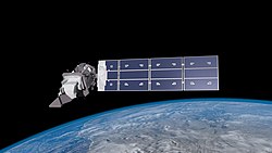

An important source of cartographic data is imagery collected from remote sensing, including satellite imagery and aerial photos taken from cameras mounted in aircraft or drones. Remote sensing can collect data from various signals: the electromagnetic spectrum (visible light, infrared, microwave, and radar); as well as LIDAR and SONAR reflections. Some imagery contains multiple spectral bands. This multispectral or hyperspectral imagery can be exploited by algorithms to extract information about conditions on the Earth's surface not possible with a single band. Applications of remote sensing extend far beyond cartography and include change detection, forestry, agriculture, farming, vegetation analysis, geology and earth sciences, and hydrology.
Before imagery can be used for mapmaking, the images must be georeferenced using principles of photogrammetry. One way to georeference an image is to locate several small, identifiable points in the image (such as street intersections, or small landmarks) that have a known geographic location which may be known from traditional surveying; or from satellite navigation measurement; or from a map or orthophoto that has been georeferenced.
Provided that the imagery has been properly georeferenced, it can be used to extract precise geographic coordinate values for any identifiable objects in the image. For example, a cartographer can extract the locations of terrain and feature data (such as rivers, roads, and buildings) for storage in a database.
Rectified imagery

Many images used in cartography undergo an additional processing step called orthorectification, which requires accurate digital terrain data covering the region. With the terrain data, imagery can be resampled to generate a view as if the viewer were directly above, looking straight down. Such orthorectified images are suitable for use in a map, and will properly align with other geographic elements in the map. Orthorectified imagery can be used directly in a map as a background basemap.
If imagery contains buildings, simple orthorectification may produce orthophotos in which the buildings appear to be tilted or leaning. If that is not acceptable for the map being produced, the mapmaker can instead generate "true orthophotos" that rectify buildings and other structures so they appear as if the viewer were looking straight down from directly above. Rectifying structures requires that they be modeled either within the terrain database, or separately from the terrain as 3D wireframe models.
Searching and indexing

Cartographic data may be roughly grouped into three categories: spatial, temporal, and attributes (which includes all other information about features or terrain, including metadata). Depending on the nature of the map being created, a cartographer may limit data searches on one or more of those data categories. For example, a mapmaker could query a database and ask for railway data covering Sri Lanka in 1990 including the track gauge of each railway segment.
When preparing a map, it may be difficult to locate relevant data within a database, especially if the database contains vast amounts of information. Databases can help with that process if they contain indexes which support efficient retrieval, searching, and sorting. Indexes to search and sort geographic data (that is, spatial data) require special computer technologies, because spatial data is not comparable to simple numerical or textual data.
Raster and vector data
Cartographic data that models the real world is often stored in raster format or vector format. Imagery is commonly stored in a raster format, but linear or areal features (such as roadways, boundaries, or building outlines) are typically stored as vector data. To perform certain kinds of analysis, the data get transformed from one form to the other. Software algorithms exist that automatically detect lines, edges, and boundaries within imagery and generate vector data that roughly delineates roads, buildings, and other linear or areal objects.
Spatial relationships between nearby objects can be explicitly stored with the objects' vector data in a database. This geospatial topology data can encode whether two features overlap, one is inside another, they share a boundary line, or if they are connected, as well as hierarchical relationships such as which road segments make up a particular roadway. Vector data stored without topological relationships is sometimes disparagingly referred to as "spaghetti data".
Terrain data is commonly stored in a raster format, although it may also be stored as a triangular irregular network. Terrain data, by itself, can be used by cartographers to derive important geographic information such as elevation contour lines, drainage basins, line-of-sight, drainage divides, viewsheds, volume of filled depressions, and watercourses.
Attributes and metadata
When storing geographic data in a cartographic database, any attributes or metadata of the data may be useful to mapmakers. Attributes include informstion such as the year the geographic data was collected, identification numbers, geodetic datum, error estimates, the origin or source of the data, and any miscellaneous notes. Attributes can be used, for example, to supply annotations for the map or notes in the map's legend.
Accuracy
Terminology

Accuracy and precision have distinct meanings in cartography: accuracy is an estimate of error between an object's true location and its location presented in the map. Precision is the granularity (or resolution) of location values in the map (disregarding the true value). Some cartographers stipulate that the precision of a map is the real-world distance represented by half a millimeter (on a paper map) or by half a pixel (in raster imagery).
A related term is "detectable size" which is the width of the smallest discernible feature in a map, generally considered to be twice the precision. Tobler's Rule states that the detectable size (in meters) times 1000 is equal to the map scale.
Accuracy estimates
For some cartographic applications (for example, military targeting purposes) it is essential that the geographic data be georeferenced, but it is also critical to have an estimate of the spatial accuracy. The magnitude of the cumulative error can increase each time that geographic data is processed, manipulated, or converted (such as converted from one coordinate system to another). Cartographic data used for critical applications should include error estimates for all important data. One source of inaccuracies in a map is passage of time: a map may be accurate when created, but as years pass, new structures may be built, old structures demolished, and roads rerouted.
Ideally, the accuracy of data and features in a map is communicated to the user of the map, for example, in the map legend. There is no international standard specifying how accurate maps should be. Some individual nations regulate maps produced by their own government agencies to ensure accuracy, consistency, and conformity. In 1947, the US government established a standard that the horizontal error of 95% of sampled points should be less than 0.85 mm (measured on the map) for paper maps of scale 1:20,000 or finer. In 1998, the US changed the guidance to eliminate a maximum error value, and instead specify that cartographers should estimate an error value (with a specified algorithm) and include the error estimate with the map. Geographer Paul Longley suggested a rule of thumb that horizontal positional errors are roughly equal to a map's precision.
Interactive maps may provide the ability for users to update or add to shared geographic data, as a form of crowdsourcing. The accuracy of crowd-sourced data may be poor, as it may not be subject to quality assurance reviews.
Publication and distribution
The final steps of the map production process include publication and distribution. For paper maps, a printing facility must be used to produce copies. For digital maps, the cartographer must consider the device upon which the users will be viewing the map, particularly the size of its screen, the screen resolution, and how close the viewer will be to the screen; these factors must be addressed early, during the map design process.
A variety of platforms are available to disseminate digital maps, including websites, file downloads, or sharing via online map databases. The choice of distribution platform may determine whether a large amount of data may be included in a map (which may be feasible if the platform supports data filtering); or if multiple map products must be separately published (one per data type). The publisher may choose to host the map data on their own server, or use a commercial server. When a map is distributed as a downloadable file, the file format options are important. Raster formats include TIFF, PNG, and JPEG. Vector formats include SVG, PDF, Shape, and Adobe Illustrator AI.
Prior to publication, copyright and licensing policies should be established and documented. Legal disclaimers (related to potential errors in cartographic data) may be needed if liability is a concern. Publicity, advertising, and outreach can help increase the size of the audience that the map reaches.
Profession and regulation
Cartographers have organized several professional associations that seek to promote the advancement and dissemination of knowledge by hosting conferences and publishing journals. A leading group is the International Cartographic Association which publishes the International Journal of Cartography and The Cartographic Journal. Other organizations include the International Society for Photogrammetry and Remote Sensing, International Geographical Union, National Geographic Society, and Royal Geographical Society. In addition to professional organizations, most nations maintain agencies or departments that are responsible for producing maps, such as Geoscience Australia and Japan's Geospatial Information Authority. Production standards for navigational charts are coordinated by the International Hydrographic Organization (nautical charts) and the International Civil Aviation Organization (aeronautical charts).
Society and culture
Bias and disinformation


All maps are selective representations of reality and cannot depict it with complete accuracy. As a result, every map contains some degree of inaccuracy, distortion, or omission. In some cases, these inaccuracies are introduced intentionally; in other cases, they are an inherent consequence of the fact that maps simplify and symbolize reality. Situations where mapmakers deliberately try to mislead the audience include advertising, development planning, military disinformation campaigns, and political propaganda. Geographers J.B. Harley and Mark Monmonier argue that all maps should be treated with skepticism because they reflect editorial and content choices made by their creators.
Some map projections can significantly misrepresent the relative size of countries, particularly in world maps. In the 1970s, the historian Arno Peters asserted that the widespread use of the Mercator projection was "cartographic imperialism", as it showed European countries relatively enlarged compared to developing countries–especially in Africa–nearer to the equator. Arno presented the Gall-Peters projection–an equal-area projection–as a more equitable alternative.
In 1985 politician Shridath Ramphal appealed to geographers to combat bias implicit in maps, particularly related to the north up orientation and the implication that northern countries are superior.
An example of misinformation that is deliberately inserted into a map is a copyright trap, which is a fictional object or place inserted into a map (in an unobtrusive manner) by the mapmaker, that will help them detect unauthorized copies.
Boundary disputes
Maps can play a role in boundary disputes between nations; as tools for a nation to advocate for their claim, and as evidence in negotiations. With the advent of interactive online maps, countries involved in disputes will often instruct data providers, such as Google Maps, to display a particular boundary line. Google Maps has responded to such demands by storing two versions of the disputed boundary, and choosing the version to display based on the location of the requestor. Examples of boundary disputes that have led nations to instruct map providers to display a particular boundary line include: Russia and Ukraine, India and China, Pakistan and India, Turkey and the cultural region of Kurdistan, Cambodia and Thailand, and Vietnam and China's maritime boundary dispute in the South China Sea.
Gerrymandering

Maps can be used to skew election results by establishing voting district boundaries in a way that favors a particular outcome–generally the political group in power creates electoral maps that are designed to keep the group in power, by diminishing the representation of other groups. This process is called gerrymandering. Gerrymandering is an example of the broader modifiable areal unit problem, whereby changes to the boundaries of geographic regions can alter statistical outcomes. The creation of software applications–in conjunction with geographic databases that indicate how individuals are likely to vote–has automated the process of gerrymandering and enabled even minority groups to define boundary lines that provide the group with majority representation in legislative bodies.
Fantasy maps
Some maps are created which depict imaginary regions or worlds. Examples include maps of Treasure Island in the 1883 novel by Robert Louis Stevenson, maps of Oz from the Wizard of Oz book series (1900 to 1920) by L. Frank Baum, and maps of Middle Earth in The Lord of the Rings (1937 to 1949) by J. R. R. Tolkien. A survey of 200 fantasy books in 2013 found that 34% contained a map.
Orienteering
Orienteering is a group of sports in which participants use a map and compass to navigate from point to point in unfamiliar terrain as quickly as possible. In formal foot-orienteering competitions, participants are given a specially prepared orienteering map, usually topographical, which they use to locate control points..