Blackletter
In-game article clicks load inline without leaving the challenge.
Blackletter (also black letter or sometimes black-letter; sometimes popularly known as Gothic minuscule or Gothic type) was originally a medieval book hand (Textualis or Textura) of the Gothic family of scripts, later adapted into typefaces and still used in modern calligraphy and typesetting.
The book script was used throughout Western Europe from approximately the late 12th until the 17th century. It continued to be commonly used for Danish, Norwegian, and Swedish until the 1870s, Finnish until the turn of the 20th century, Estonian and Latvian until the 1930s, and for the German language until the 1940s, when Adolf Hitler officially banned it in 1941. Fraktur is a notable script of this type, and sometimes the entire group of blackletter faces is referred to as Fraktur. Blackletter, although sometimes called Old English lettering, is not to be confused with the Old English language, which predates blackletter by many centuries and was written in the insular script or in Futhorc runes. Along with Italic type and Roman type, blackletter served as one of the major typefaces in the history of Western typography.
Whilst black letter does have a specific meaning in manuscript palaeography, the term today more often refers to typefaces, for example the Fraktur unicode block.
Etymology
Black letter was used as a descriptive term to distinguish the heavy, thick typeface from the thinner "white letter" or humanistic scripts also in use at the time. An alternative etymology suggests the script, written large, bold and black, came to be associated with mourning or with inauspicious times — hence ‘black-letter’ days.
Gothic type is named after the Gothic script.
Blackletter script should not be confused with either the ancient alphabet of the Gothic language nor with the sans-serif typefaces that are also sometimes called Gothic.
Handwriting script

Black letter is a popular synonym for the Gothic Textualis or Textura family book hands originally developed from Protogothic from the end of the 12th century, characterised by lateral compression resulting in narrow, tall letter forms, square aspects and more elaborate treatment of minims. The scripts became known as Textura or Textualis because of their 'woven' look: the Latin verb texo means 'to weave' or 'plait', as in basket-work. It thus comes to mean 'fit together intricately in a regular pattern'. The treatment of minims is the determining feature in a descending hierarchy of four grades of textualis used to palaeographers and codicologists in diplomatics:
- Prescissa - meaning 'cut off', also known as Sine Pedibus, referring to the way in which the minims and some taller letters such as tall s and f lack 'feet': instead of ending with a serif, they are cut off in a neat horizontal at the base-line.
- quadrata - meaning 'square', also known as Fracta.
- Semi-Quadrata
- Rotunda - meaning 'round'.
Carolingian minuscule was the ultimate ancestor of Textualis/Blackletter via Protogothic. An increasingly literate 12th-century Europe required new books in many different subjects; new universities were founded, each producing books for business, law, grammar, history and other pursuits, not solely religious works, for which earlier scripts typically had been used.
The Gothic Textualis system provided distinct categories of script suited for use in a well perceived contemporary hierachy of books and texts, from de luxe liturgical volumes to university textbooks. The scripts were used in a secular production context in which clerics often participated and the monastic scriptorium alike.
Blackletter typesetting

Textualis, also known as textura or "Gothic book hand", was the most calligraphic form of blackletter, and today is the form most associated with "Gothic". Johannes Gutenberg carved a textualis typeface—including a large number of ligatures and common abbreviations—when he printed his 42-line Bible. However, textualis was rarely used for typefaces after this.
While an antiqua typeface is usually a compound of roman types and italic types since the 16th-century French typographers, the blackletter typefaces never developed a similar distinction. Instead, they use letterspacing (German Sperrung) for emphasis. When blackletter is letterspaced, ligatures like ⟨ch⟩, ⟨ck⟩, ⟨tz⟩ or ⟨ſt⟩ remain together without additional letterspacing (⟨ſt⟩ is dissolved, though).
The use of bold text for emphasis is also alien to blackletter typefaces.
Words from other languages, especially from Romance languages, including Latin, are usually typeset in antiqua instead of blackletter. The practice of setting foreign words or phrases in antiqua within a blackletter text does not apply to loanwords that have been incorporated into the language.
Printers of the late 15th and early 16th centuries commonly used blackletter typefaces, but under the influence of Renaissance tastes, Roman typefaces grew in popularity, until by about 1590 most presses had converted to them. However, blackletter was considered to be more readily legible (especially by the less literate classes of society), and it therefore remained in use throughout the 17th century and into the 18th for documents intended for widespread dissemination, such as proclamations and Acts of Parliament, and for literature aimed at the common people, such as ballads, chivalric romances, and jokebooks.
Chaucer's works had been printed in blackletter in the late 15th century, but were subsequently more usually printed in Roman type. Horace Walpole wrote in 1781 that "I am too, though a Goth, so modern a Goth that I hate the black letter, and I love Chaucer better in Dryden and Baskerville than in his own language and dress."
Schwabacher typefaces dominated in Germany from about 1480 to 1530, and the style continued in use occasionally until the 20th century. Most importantly, all of the works of Martin Luther, leading to the Protestant Reformation, as well as the Apocalypse of Albrecht Dürer (1498), used this typeface. Johann Bämler, a printer from Augsburg, probably first used it as early as 1472. The origins of the name remain unclear; some assume that a typeface-carver from the village of Schwabach—one who worked externally and who thus became known as the Schwabacher—designed the typeface.
Johann Gutenberg used a textualis typeface for his famous Gutenberg Bible in 1455. Schwabacher, a blackletter with more rounded letters, soon became the usual printed typeface, but it was replaced by Fraktur in the early 17th century.
Forms

Schwabacher
Schwabacher was a blackletter form that was much used in early German print typefaces. It continued to be used occasionally until the 20th century. Characteristics of Schwabacher are:
- The small letter ⟨o⟩ is rounded on both sides, though at the top and at the bottom, the two strokes join in an angle. Other small letters have analogous forms.
- The small letter ⟨g⟩ has a horizontal stroke at its top that forms crosses with the two downward strokes.
- The capital letter ⟨H⟩ has a peculiar form somewhat reminiscent of the small letter ⟨h⟩.
Fraktur
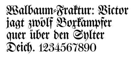
Fraktur is a form of blackletter that became the most common German blackletter typeface by the mid-16th century. Its use was so common that often any blackletter form is called Fraktur in Germany. Characteristics of Fraktur are:
- The left side of the small letter ⟨o⟩ is formed by an angular stroke, the right side by a rounded stroke. At the top and at the bottom, both strokes join in an angle. Other small letters have analogous forms.
- The capital letters are compound of rounded ⟨c⟩-shaped or ⟨s⟩-shaped strokes.
Here is the entire alphabet in Fraktur (minus the long s ⟨ſ⟩ and the sharp s ⟨ß⟩), using the AMS Euler Fraktur typeface:
A B C D E F G H I J K L M N O P Q R S T U V W X Y Z {\displaystyle {\mathfrak {A}}{\mathfrak {B}}{\mathfrak {C}}{\mathfrak {D}}{\mathfrak {E}}{\mathfrak {F}}{\mathfrak {G}}{\mathfrak {H}}{\mathfrak {I}}{\mathfrak {J}}{\mathfrak {K}}{\mathfrak {L}}{\mathfrak {M}}{\mathfrak {N}}{\mathfrak {O}}{\mathfrak {P}}{\mathfrak {Q}}{\mathfrak {R}}{\mathfrak {S}}{\mathfrak {T}}{\mathfrak {U}}{\mathfrak {V}}{\mathfrak {W}}{\mathfrak {X}}{\mathfrak {Y}}{\mathfrak {Z}}}
Donatus-Kalender
The Donatus-Kalender (also known as Donatus-und-Kalender or D-K) is the name for the metal type design that Gutenberg used in his earliest surviving printed works, dating from the early 1450s. The name is taken from two works: the Ars grammatica of Aelius Donatus, a Latin grammar, and the Kalender (calendar). It is a form of textura.
Modern use
Among the modern uses of blackletter typefaces are some newspaper logos and nameplates, such as those of The New York Times, The Los Angeles Times, and The Sydney Morning Herald, which are written with them in a style choice that "lends gravitas to the publication" by evoking the origins of typesetting and the printing press, as blackletter was the typeset with which Johannes Gutenberg printed the Gutenberg Bible.
The association of blackletter with printed news media, in turn, was described as one of the meanings of the cover art of Taylor Swift's album Reputation, released in 2017, which features the album's title and the artist's name written in Textur blackletter. According to People Magazine, the cover strongly conveys the media scrutiny on her personal life preceding the album's release, including her longstanding feud with Kanye West and Kim Kardashian.
Unicode
Mathematical blackletter characters are separately encoded in Unicode in the Mathematical alphanumeric symbols range at U+1D504-1D537 and U+1D56C-1D59F (bold), except for individual letters already encoded in the Letterlike Symbols range (plus long s at U+017F). Fonts supporting the range include Code2001, Cambria Math, Noto Sans Math, and Quivira (textura style).
This block of characters is intended for use in setting mathematical texts, which contrast blackletter characters with other letter styles. Outside of mathematics, the character set has seen some limited decorative use, but it lacks punctuation and other characters necessary for running text, and the Unicode standard for setting non-mathematical material in blackletter is to use ordinary Latin code points with a dedicated blackletter font.
| 𝔄 | 𝔅 | ℭ | 𝔇 | 𝔈 | 𝔉 | 𝔊 | ℌ | ℑ | 𝔍 | 𝔎 | 𝔏 | 𝔐 | 𝔑 | 𝔒 | 𝔓 | 𝔔 | ℜ | 𝔖 | 𝔗 | 𝔘 | 𝔙 | 𝔚 | 𝔛 | 𝔜 | ℨ |
| 𝔞 | 𝔟 | 𝔠 | 𝔡 | 𝔢 | 𝔣 | 𝔤 | 𝔥 | 𝔦 | 𝔧 | 𝔨 | 𝔩 | 𝔪 | 𝔫 | 𝔬 | 𝔭 | 𝔮 | 𝔯 | 𝔰 | 𝔱 | 𝔲 | 𝔳 | 𝔴 | 𝔵 | 𝔶 | 𝔷 |
| 𝕬 | 𝕭 | 𝕮 | 𝕯 | 𝕰 | 𝕱 | 𝕲 | 𝕳 | 𝕴 | 𝕵 | 𝕶 | 𝕷 | 𝕸 | 𝕹 | 𝕺 | 𝕻 | 𝕼 | 𝕽 | 𝕾 | 𝕿 | 𝖀 | 𝖁 | 𝖂 | 𝖃 | 𝖄 | 𝖅 |
| 𝖆 | 𝖇 | 𝖈 | 𝖉 | 𝖊 | 𝖋 | 𝖌 | 𝖍 | 𝖎 | 𝖏 | 𝖐 | 𝖑 | 𝖒 | 𝖓 | 𝖔 | 𝖕 | 𝖖 | 𝖗 | 𝖘 | 𝖙 | 𝖚 | 𝖛 | 𝖜 | 𝖝 | 𝖞 | 𝖟 |
Note: (The above may not render fully in all web browsers.)
Gallery
- Various German language blackletter typefaces
- Blackletter typefaces highlighting differences between select characters
- Modern interpretation of blackletter script in the form of the font "Old English" which includes several anachronistic glyphs, such as Arabic numerals, ampersand (instead of Tironian et) and several punctuation marks, but lacks letter alternatives like long ⟨s⟩ and ⟨r⟩ rotunda, scribal abbreviations and ligatures, and contains several relatively modern versions of letters such as ⟨x⟩, which is confusable with the letter ⟨r⟩.
See also
- Antiqua (typeface class)
- Asemic writing
- Bastarda
- Book hand
- Calligraphy
- Chancery hand
- Court hand (also known as common law hand, Anglicana, cursiva antiquior, or charter hand)
- Cursive
- Handwriting
- History of writing
- Italic script
- Law hand
- Paleography
- Penmanship
- Ronde script (calligraphy)
- Rotunda (script)
- Round hand
- Secretary hand
Further reading
- Bernhard Bischoff, Latin Palaeography: Antiquity and the Middle Ages, Cambridge University Press, 1989.
- Bain, Peter; Shaw, Paul, eds. (1998). Blackletter: type and national identity. Cooper Union for the Advancement of Science and Art. Princeton Architectural Press. ISBN 978-1-56898-125-3.
External links
- (A comprehensive PDF file containing 82 pages profusely illustrated, January 2024).
- A simple OpenType blackletter font setting ſ and s by itself